main topic interpreting results session command see also
As part of a study to test the effect of temperature and glass type upon the light output of an oscilloscope, you assessed three glass types and three temperatures, 100, 125, and 150 degrees Fahrenheit. In the study, you determined that the light output can be predicted by temperature and the type of glass. Furthermore, you found that the interactions are significant. Now, you want to create a main effects plot and an interaction plot to display these relationships between the response and variables.
You do not need to re-analyze the model. The worksheet contains the stored model that is necessary for the factorial plots. This example uses a regression model. However, the principles are the same for a response surface model.
1 Open the worksheet LIGHTOUTPUT_MODEL.MTW.
2 Choose Stat > Regression > Regression > Factorial Plots.
3 In Response, choose LightOutput.
4 In Variables
to Include in Plots, click ![]() to
include both GlassType and Temperature. Click OK.
to
include both GlassType and Temperature. Click OK.
Graph window output
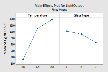

The main effects are only interpretable if the interaction effects are not significant. The main effects plot displays the response means for each factor level. A horizontal line is drawn at the grand mean. The effects are the differences between the means and the reference line. In the example, the temperature effects upon light output are large compared to the effects of glass type.
The interaction plot shows the mean light output versus the temperature for each of the three glass types. The legend shows which symbols and lines are assigned to the temperatures. The means of the factor levels are plotted in sorted order if numeric or date/time or in alphabetical order if text, unless value ordering has been assigned (see Ordering Text Categories).
Interaction is present when the response at a factor level depends upon the level(s) of other factors. Parallel lines in an interactions plot indicate no interaction. The greater the departure of the lines from the parallel state, the higher the degree of interaction. This plot shows apparent interaction because the lines are not parallel, implying that the effect of temperature upon light output depends upon the glass type.
The graphs cannot determine whether the main effects and interaction effects are significant. However, the investigators performed regression analysis on these data and determined that the p-values for all effects are 0.000.
For the light output data, because the interactions are significant, the investigators cannot interpret the main effects. For this case, the light output is greatest when temperature is 150, except for glass type 3 where a temperature of 125 is best.
These plots use a model equation. Ensure that your model is adequate before you interpret the plots.