main topic interpreting results session command see also
In the fertilizer example, you generated a design, supplied the response data, and fit a linear model. Because this linear model suggested that a higher-order model is needed to adequately model the response surface, you fit the full quadratic model. The full quadratic provides a better fit, with the squared terms for nitrogen and phosphoric acid and the nitrogen by potash interaction being important. The example below is a continuation of this analysis. Now you want to try an understand these effects by looking at a surface plot of snap bean yield versus the significant factors - nitrogen and phosphoric acid.
You do not need to re-analyze that response surface model. The worksheet contains the model for the surface plot.
1 Open the worksheet CCD_EX1_MODEL.MTW.
2 Choose Stat > DOE > Response Surface > Surface Plot.
3 In Response, choose BeanYield.
4 Under Variables, in X Axis, choose Nitrogen.
5 Under Variables, in Y Axis, choose PhosAcid.
6 Click OK.
Graph window output
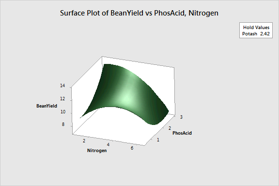
The surface plot shows that the highest yield is obtained when nitrogen levels are low and phosphoric acid levels are high. In addition, you can see the shape of the response surface and get a general idea of yield at various settings of nitrogen and phosphoric acid.
This plot uses a model equation. Ensure that your model is adequate before you interpret the plot.