main topics see also
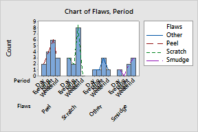
In the Example of a clustered bar chart of counts, you examine the number of rejected door panels for each type of paint flaw, clustered by time period. You want to add and customize the connect lines.
|
Groups Add connect lines and a grouping variable. 1 Choose Editor > Add > Data Display. 2 Under Data Display, check Connect line. 3 Click OK. 4 Double-click the connect line. 5 Click the Groups tab. 6 In Assign attributes by categorical variables, enter Flaws. 7 Click OK. |
|
|
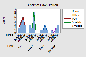
Attributes Change the line type and width. 1 Select and double-click all connect lines. 2 Under Lines, choose Custom.
3 Click OK. |
|
|
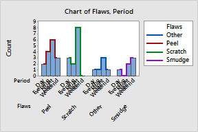
Connect options Change the connection function. 1 Select and double-click all connect lines. 2 Click the Connect Options tab. 3 Under Connection function, choose Step. Then choose Center. 4 Click OK. |
|
|
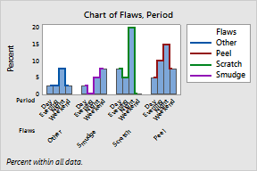
Chart options Change the bar order and scale. 1 Select and double-click all connect lines. 2 Click the Chart Options tab. 3 Under Order Main X Groups By, choose Increasing Y. 4 Under Percent and Accumulate, check Show Y as Percent. 5 Click OK. |
|