main topic interpreting results session command see also
Suppose you want to examine trends in employment in the food industry in Wisconsin. You want to compare monthly employment data for five years.
1 Open the worksheet EMPLOY.MTW.
2 Choose Graph > Time Series Plot.
3 Choose Simple and click OK.
4 In Series, enter Food.
5 Click Time/Scale.
6 Under Time Scale, choose Calendar and choose Month Year.
7 Under Start Values, choose One set for all variables.
8 Under Month, enter 1. Under Year, enter 1997. Click OK.
9 Click Multiple Graphs, then click the By Variables tab.
10 Choose Split data across panels.
11 Under Data per panel, enter12. Click OK in each dialog box.
Graph window output
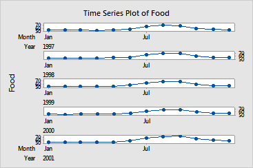
Splitting the graph across panels makes it easy to compare the yearly trends in employment. Each year, employment in the food industry is slow in the winter months, balloons in the mid- to late-summer and early fall, then falls off again as winter approaches.