main topic how to example see also
You can create a graph that overlays multiple graph variables (or pairs of variables, as in the scatterplot below) in the same data region. An overlaid graph contains:
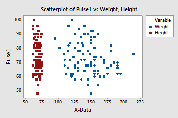
Graphs with continuous scales use the Multiple Graphs button in the graph dialog box to display as an overlaid graph. Graphs with categorical scales use one of the Multiple gallery options to achieve a similar effect; variables share a common data scale, and the categorical scales share an axis.
In the case of overlaid scatterplots or time series graphs, you can add a secondary scale when two or more variables with dissimilar ranges share the same axis.