main topic see also
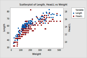
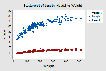
Suppose you have created an overlaid scatterplot displaying the relationships between two different y-axis variables and a common x-axis variable. Although you know the correlation of both pairs is very high, the resulting graph does not reflect this. Because the individual ranges of the y-axis variables are so different, adding a secondary scale may remedy the deceptive appearance.
Step 1: Create the graph
1 Open the worksheet BEARS.MTW.
2 Choose Graph > Scatterplot.
3 Click Simple, and then click OK.
4 In row 1, under Y, enter Length and under X, enter Weight.
5 In row 2, under Y, enter Head.L and under X, enter Weight.
6 Click Multiple Graphs and click the Multiple Variables tab.
7 Under Show Graphs of Different Variables, choose Overlaid on the same page, and click OK in each dialog box.
Graph window output
Step 2: Assign a secondary scale
1 Double-click the y-axis.
2 Click the Secondary tab.
3 Under Scale for Length, select Primary from the drop-down list.
4 Under Scale for Head.L, select Secondary from the drop-down list. Click OK.
Graph window output