main topic see also
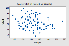
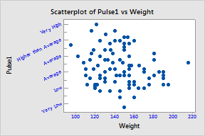
Suppose you have created a simple scatterplot for a presentation. You want to edit the scale's display, scale attributes, labels, font, and alignment.
|
Creation 1 Open the worksheet PULSE.MTW. 2 Choose Graph > Scatterplot 3 Choose Simple and click OK. 4 In Y, enter Pulse1. In X, enter Weight. 5 Click OK. |
|
|
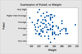
Display 1 Double-click the y-scale. 2 Click the Show tab. 3 Check every item in the Low column, and check Axis line in the High column. 4 Click OK. |
|
|
Attributes 1 Double-click the y-scale. 2 Click the Attributes tab. 3 Under Tick Orientation, choose Inside. 4 In Length of Major Ticks, enter 0.02. 5 Click OK. |
|
|
Labels 1 Double-click the y-scale. 2 Click the Labels tab. 3 Under Major Tick Labels, choose Specified and enter 'Very Low' Low Average Average 'Higher than Average' 'Very High'. 5 Click OK. |
|
|
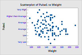
Font 1 Double-click the y-scale. 2 Click the Font tab. 3 From
Color, choose
4 Check Apply same font to all tick labels. 5 Click OK. |
|
|
Alignment 1 Double-click the y-scale. 2 Click the Alignment tab. 3 In Angle, enter 25. 4 Click OK. |
|