main topics interpreting results session command see also
You want to know whether your pager voltage data follow the normal distribution, so you create a probability plot. You transpose the axes to display percents on the horizontal axis.
1 Open the worksheet BATTERIES.MTW.
2 Choose Graph > Probability Plot > choose Single > OK.
3 In Variables, enter VoltsC.
4 Click Scale, then click the Axes and Ticks tab.
5 Check Transpose Y and X, then click OK in each dialog box.
Graph window output
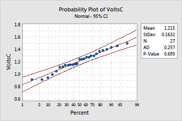
Visually, your pager data appear to follow the normal distribution, because all the data fall along the plotted line within the confidence intervals.
Statistically, you can conclude that the normal distribution appears to fit your data, because the Anderson-Darling statistic (AD) is 0.2582 and the p-value (P) is 0.691.