main topic interpreting results session commands see also
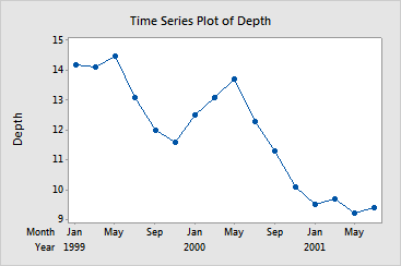
Suppose you want to see how the depth of a reservoir fluctuates over time. You collect measurements every other month for 16 months, starting in January of 1999. Create a time series plot with custom start times.
|
Note |
You can also use custom start times with area graphs. |
1 Open the worksheet EXH_GRPH.MTW.
2 Choose Graph > Time Series Plot.
3 Choose Simple, then click OK.
4 In Series, enter Depth.
5 Click Time/Scale.
6 Under Time Scale, choose Calendar, then choose Month Year.
7 Under Start Values, choose One set for all variables.
8 Under Month, type 1. Under Year, type 1999.
9 In Data Increment, type 2. Click OK in each dialog box.
Graph window output
|
More |
If a graph has too many tick labels, you can hide some. See Axes and Ticks. |
The time series plot shows data points for every other month, starting with January 1999.