main topic interpreting results session commands see also
You are an analyst with the Wisconsin Department of Workforce Development and you want to examine the trends in employment in three industries in Wisconsin over five years: Wholesale and Retail Trade, Food and Kindred Products, and Fabricated Metals. Create an area graph.
1 Open the worksheet EMPLOY.MTW.
2 Choose Graph > Area Graph.
4 In Series, enter Trade Food Metals.
5 Click Time/Scale.
6 Under Time Scale, choose Calender, then choose Month Year.
7 For start values, under Month, type 1. Under Year, type 1998.
8 Click OK in each dialog box.
Graph window output
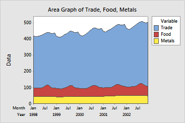
Employment for the Metals industry (bottom line) was fairly flat.
Employment for the Food industry (summed with Metals as center line) demonstrates a cyclic pattern, peaking around August. Overall, combined employment for the Food and Metals industries did not change appreciably over the five years.
Combined employment for all industries (top line) also demonstrated a cyclic pattern, with peaks around August and February. The August peaks are at least partially due to the cyclical employment in the Food industry. Overall, combined employment for all industries together increased over the five years, reflecting an increase mostly in Trade employment.