main topic interpreting results session commands see also
You are a quality engineer for a company that makes door panels for automobiles. Each week, some panels are rejected because of paint flaws. You suspect a relationship between the time period and the flaw. Create a bar chart to determine the number of rejected panels for each type of paint flaw, stacked by time period. Choose decreasing order to see the outermost categories arranged from largest to smallest.
1 Open the worksheet EXH_QC.MTW.
2 Choose Graph > Bar Chart.
3 From Bars represent, choose Counts of unique values.
4 Choose Stack, then click OK.
5 In Categorical variables (2-4, outermost first), enter Flaws Period.
6 Make sure that Stack values of last categorical variable is checked.
7 Click Bar Chart Options.
8 Under Order Main X Groups By, choose Decreasing Y. Click OK in each dialog box.
Graph window output
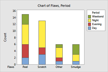
The bar chart shows that the most frequent flaw is Peel, followed by Scratch, Other, and Smudge. Within each category, you can see the number of flaws per time period. Most flaws occurred at night for three out of four categories.
|
Tip |
To see the y-axis value and the subtotal for a particular bar segment and those below it, hover your cursor over the segment. |