main topic interpreting results session commands see also
Your company makes plastic pipes and you are concerned about the consistency of the diameters. You measure ten pipes a week for three weeks from each machine. Create a boxplot to examine the distributions.
1 Open the worksheet PIPE.MTW.
2 Choose Graph > Boxplot.
3 Under Multiple Y's, choose With Groups. Click OK.
4 In Graph variables, enter 'Week 1' 'Week 2' 'Week 3'.
5 In Categorical variables for grouping (1-3, outermost first), enter Machine.
6 Under Scale Level for Graph Variables, choose Graph variables displayed innermost on scale. Click OK.
Graph window output
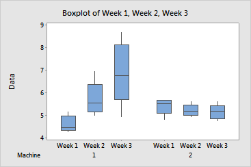
The boxplot shows:
You may want to perform statistical analyses, such as balanced MANOVA, to further examine the relationship between factors.
|
Tip |
To see precise information for Q1, median, Q3, interquartile range, whiskers, and N, hover your cursor over any part of the boxplot. To see an outlier's y-axis value and row number, hover your cursor over the outlier. |