main topics interpreting results session command see also
You work in a car dealership. Your customers want a convenient way to compare the fuel economy (measured in miles per gallon, or MPG) and the cost of each vehicle. You decide to create a bubble plot to summarize fuel economy and cost.
1 Open the worksheet BUBBLEPLOT.MTW.
2 Choose Graph > Bubble Plot.
3 Choose With Groups, and then click OK.
4 In Y variable, enter 'Hwy MPG'.
5 In X variable, enter 'City MPG'.
6 In Bubble size variable, enter 'Retail ($1000)'.
7 In Categorical variables for grouping, enter Fuel.
8 Click Labels.
9 On the Data Labels tab, under Label Type, choose Use labels from column, and then enter Type.
10 Click OK in each dialog box.
Graph window output
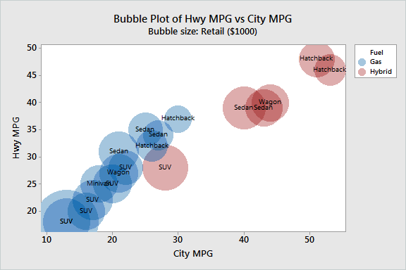
The bubble plot shows that Highway (Hwy) and City mileage are highly correlated. Cars with better city mileage also tend to have better highway mileage.
The red bubbles represent hybrid vehicles, which use a combination of electric power and gas. The blue bubbles represent vehicles that are powered only by gas. Not surprisingly, all 5 of the cars that have the best mileage are hybrid vehicles. Hybrid cars appear to be especially beneficial for city driving. The best hybrid gets approximately 25 more miles per gallon than does the best gas vehicle. For highway driving, the difference is less. The best hybrid gets approximately 10 more miles per gallon than does the best gas vehicle.
Most of the larger bubbles belong to SUVs (sport utility vehicles), which indicates that SUVs are the most expensive vehicles. SUVs also tend to get the fewest miles per gallon, because they weigh more than most other vehicles. The hybrid that has the worst mileage is an SUV.