main topic interpreting results session command see also
You work in an auto factory and are having trouble with variability in the length of the camshafts you use. You want to see if the shafts provided by your two suppliers are comparable, so you measure length for a random sample of 100 shafts from each. Create a dotplot with groups to compare the samples from the two suppliers.
1 Open the worksheet CAMSHAFT2.MTW.
2 Choose Graph > Dotplot.
3 Choose One Y - With Groups, then click OK.
4 In Graph variables, enter Length.
5 In Categorical variables for grouping (1-4, outermost first), enter Supplier.
6 Click the Data View tab. In Categorical variables for attribute assignment, enter Supplier.
7 Click OK in each dialog box.
Graph window output
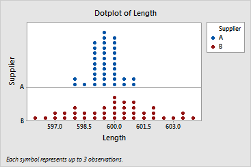
The mean lengths of the camshafts from the two suppliers appear to be similar. However, there is a great deal more variability in the length of shafts provided by supplier B. You might investigate supplier B's process more carefully.
|
Tip |
To see the bin range for a dot, hover your cursor over it. |