main topic interpreting results session command see also
Your company makes plastic pipes, and you want to test the consistency of their diameters. You measure 10 pipes a week for 3 weeks. Create a dotplot to display the results.
1 Open the worksheet PIPE.MTW.
2 Choose Graph > Dotplot.
3 Choose Multiple Y's - Stack Y's, then click OK.
4 In Graph variables, enter 'Week 1' 'Week 2' 'Week 3'. Click OK.
Graph window output
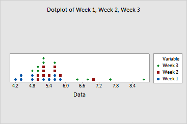
Most diameters range from about 4.7 to 5.8. However, several diameters (one from Week 2 and four from Week 3) are greater than 6.4. One diameter from Week 3 is close to 9.0. Variability in pipe diameters appears to increase from week to week, and the means may also be increasing.
|
Tip |
To see the bin range for a dot, hover your cursor over it. |
You may want to use ANOVA to compare the means. Before using ANOVA, you can use Stat >ANOVA > Test for Equal Variances to test if the variances are significantly different.