main topic interpreting results session command see also
Your company makes plastic pipes on 2 machines and you want to test the consistency of their diameters. You measure 10 pipes a week for 3 weeks from the 2 machines. Create a dotplot with groups within (symbols for each week grouped by machine) to examine the distributions.
1 Open the worksheet PIPE.MTW.
2 Choose Graph > Dotplot.
3 Choose Multiple Y's - Stack Groups, then click OK.
4 In Graph variables, enter 'Week 1' 'Week 2' 'Week 3'.
5 In Categorical variables for grouping (1-3, outermost first), enter Machine.
6 Under Scale Level for Graph Variables, choose Graph variables displayed innermost on scale. Click OK.
Graph window output
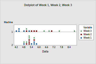
The diameters for Machine 2 appear to be stable across weeks. However, as the weeks progress, the diameters and variability of pipes produced on Machine 1 increase. Diameters for:
|
Tip |
To see the bin range for a dot, hover your cursor over it. |
You may want to use ANOVA to compare the means. The dotplot gives you reason to suspect that the variances are different for machine 1. Before using ANOVA, you can use Stat >ANOVA > Test for Equal Variances to test if the variances are significantly different.