main topics interpreting results session command see also
You want to assess the efficacy of two coatings designed to reduce the flammability of fabrics. You randomly select 15 samples each of fabric with no coating, Coating A applied, and Coating B applied. Testers then hold each sample over an open flame for a fixed amount of time and measure the length of the burned portion.
You typically use the 87th percentile as a benchmark for such tests. Create an empirical cdf graph to compare the fitted distributions for each treatment and estimate the 87th percentile for each population.
1 Open the worksheet FLAMERTD.MTW.
2 Choose Graph > Empirical CDF.
3 Choose Multiple, then click OK.
4 In Graph variables, enter Fabric - CoatingB.
5 Click Scale, then click the Percentile Lines tab.
6 Under Percentile Lines, choose At Y values, and enter 87. Click OK.
7 Click OK in each dialog box.
Graph window output
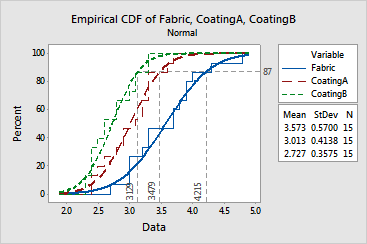
The stepped empirical cdf's follow the fitted lines fairly closely, suggesting that normal distributions fit these data fairly well. The estimated 87th percentiles for each population are:
The order of variables in the output table is the same as that in the legend.
Coating A appears to reduce fabric burn, as evidenced by the leftward shift in the fitted line and the shorter mean burn length (3.013 as compared with 3.573 for the fabric with no coating). Coating A also appears to reduce the variability in the burn lengths, as evidenced by the steeper slope of the fitted line and the smaller standard deviation (0.4138 compared to 0.5700). However, appropriate tests would need to be conducted to confirm these observations.
Coating B may be more effective than Coating A. Coating B reduced the mean burn length to 2.727 and the standard deviation to 0.3575 (see parameter estimates).