main topic interpreting results session command see also
You work in an auto factory and are having trouble with variability in the length of the camshafts you use. You want to see if the shafts provided by your two suppliers are comparable, so you measure length for a random sample of 100 shafts from each. Create a graph with overlaid fitted normal distributions of the data to compare the samples from the two suppliers.
1 Open the worksheet CAMSHAFT.MTW.
2 Choose Graph > Histogram.
3 Choose With Fit And Groups, then click OK.
4 In Graph variables, enter Supp1 Supp2. Click OK.
Graph window output
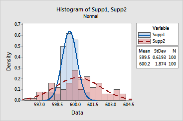
Supplier 1's camshafts appear to be shorter than Supplier 2's. This is indicated by the tabled means (599.5 and 600.2, respectively), as well as the relative position of the peaks for the fitted normal distributions.
The standard deviation for Supplier 2's sample (1.874) is much greater than that of Supplier 1 (0.6193). This translates into a shorter and wider-looking fitted distribution for Supplier 2. The large amount of variability in Supplier 2's product may be the primary cause of your problems with inconsistent camshaft lengths.