main topics interpreting results session command see also
You work for a shampoo manufacturer and need to ensure that the caps on your bottles are being fastened properly. If fastened too loosely, they may fall off during shipping. If fastened too tightly, they may be hard for your customers to open (especially in the shower).
You collect a random sample of bottles and test the amount of torque required to remove the caps. Create a histogram to evaluate the data and determine how close the samples are to the target value of 18.
1 Open the worksheet CAP.MTW.
2 Choose Graph > Histogram.
3 Choose Simple, then click OK.
4 In Graph variables, enter Torque.
5 Click Scale.
6 Under Y Scale Low and X Scale Low, check Minor ticks.
7 Click OK in each dialog box.
Graph window output
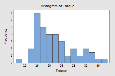
Most caps were fastened with a torque of 13 to 25. Only one cap was very loose, with a torque of less than 11. However, the distribution is positively skewed; several caps were much tighter than they should have been. Many caps required a torque of greater than 24 to remove and five caps required a torque of greater than 33, nearly two times the target value.
| Minitab help | Stat | Graph | SixSigma | DOE | Glossary | Reliability | SPC,MSA,CPK | ||
|
|||||||||