main topic interpreting results session commands see also
You want to assess the durability of four experimental carpet products. Samples of the carpet products are placed in four homes and you measure durability after 60 days. Create an interval plot to assess the durability. Include data labels for the means.
1 Open the worksheet CARPET.MTW.
2 Choose Graph > Interval Plot or Stat > ANOVA > Interval Plot.
3 Under One Y, choose With Groups. Click OK.
4 In Graph variables, enter Durability.
5 In Categorical variables for grouping (1-4, outermost first), enter Carpet.
6 Click Labels, then click the Data Labels tab.
7 From Label, choose Means. Click OK in each dialog box.
Graph window output
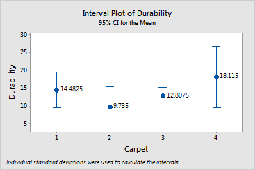
Labeling the means makes them easier to compare.
Carpet 4 has the highest mean value of 18.12, followed by Carpet 1 (14.48), Carpet 3 (12.81), and Carpet 2 (9.74). The intervals all overlap, so you cannot conclude that any of the means are different.
The confidence level for each interval is 95% by default. If you want to change the confidence level or assign a confidence level for the family of intervals, you can edit the interval bars or choose a Bonferroni confidence interval. See Select bar > Editor > Edit Interval Bar > Options.
|
Note |
A suite of methods for comparing means is available with ANOVA. |
|
Tip |
To see confidence interval information (estimate, interval, and N), hover your cursor over the interval bar. To see the mean, hover your cursor over the mean symbol. |