main topic interpreting results session commands see also
Your company makes plastic pipes, and you are concerned about the consistency of their diameters. You measure ten pipes each week for three weeks, then create an interval plot to examine the distributions.
1 Open the worksheet PIPE.MTW.
2 Choose Graph > Interval Plot or Stat > ANOVA > Interval Plot.
3 Under Multiple Y's, choose Simple. Click OK.
4 In Graph variables, enter 'Week 1' 'Week 2' 'Week 3'. Click OK.
Graph window output
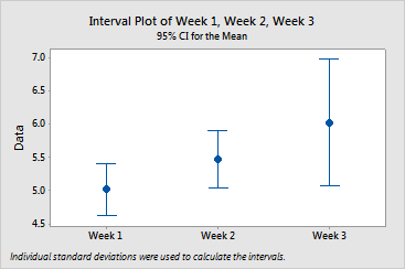
To see the mean, hover your cursor over the mean symbol. To see confidence interval information (estimate, interval, and N), hover your cursor over the interval bar. Mean diameter increases along with variability over time: