main topic interpreting results session commands see also
Your company makes plastic pipes and you are concerned about the consistency of the diameters. You measure ten pipes each week for three weeks. Create an interval plot to examine the distributions.
1 Open the worksheet PIPE.MTW.
2 Choose Graph > Interval Plot or Stat > ANOVA > Interval Plot.
3 Under Multiple Y's, choose With Groups. Click OK.
4 In Graph Variables, enter 'Week 1' 'Week 2' 'Week 3'.
5 In Categorical variables for grouping (1-3, outermost first), enter Machine.
6 Under Scale Level for Graph Variables, choose Graph variables displayed innermost on scale. Click OK.
Graph window output
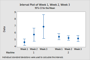
The interval plots shows:
You conclude that the variance may be related to the mean. You may want to perform other statistical analyses, such as balanced MANOVA, to further examine the relationship between factors.
|
Tip |
To see confidence interval information (estimate, interval, and N), hover your cursor over the interval bar. To see the mean, hover your cursor over the mean symbol. |