main topic interpreting results session command see also
You are analyzing bear measurement data collected by a wildlife agency. The scales normally used to weigh bears in the field are cumbersome, and you hope to find simpler measurements that can act as reliable predictors of weight. Because it is unclear which variables are closely related to weight, create a simple matrix of plots to determine the relationship among the measurements. After creating the graph, edit the text of the axis labels.
Step 1: Create the graph
1 Open the worksheet BEARS2.MTW.
2 Choose Graph > Matrix Plot.
3 Choose Matrix of plots - Simple, then click OK.
4 In Graph variables, enter 'Head.L' 'Head.W' 'Neck.G' 'Chest.G' 'Weight'.
5 Click Matrix Options.
6 Under Matrix Display, choose Lower Left. Click OK in each dialog box.
Graph window output

Step 2: Edit the axis labels
1 Double-click one of the axis labels (Head.L, Head.W, Neck.G, Chest.G, or Weight), then click Text.
2 Uncheck Auto for Variable 1.
3 Under Custom, enter Head Length.
4 Uncheck Auto for Variable 2.
5 Under Custom, enter Head Width.
6 Uncheck Auto for Variable 3.
7 Under Custom, enter Neck Girth.
8 Uncheck Auto for Variable 4.
9 Under Custom, enter Chest Girth. Click OK.
Graph window output
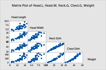
From this matrix of plots, chest girth and neck girth in a bear seem to be closely correlated with weight. It looks promising that you will be able to predict weight using other measurements.
|
Tip |
To see the row number and x- and y-values for a symbol, hover your cursor over it. |