main topics interpreting results session commands see also
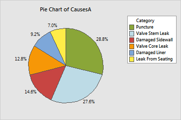
As an engineer at a tire company, you want to identify the most common causes of air loss in tires. You collect field data from a select group of service stations over a three-month period. Using your summarized data, create a pie chart of the causes of air loss.
1 Open the worksheet TIRES.MTW.
2 Choose Graph > Pie Chart.
3 Choose Chart values from a table.
4 In Categorical variable, enter CausesA. In Summary variables, enter Counts.
5 Click Pie Chart Options. Under Order slices by, choose Decreasing volume. Click OK.
6 Click Labels. Click the Slice Labels tab.
7 Under Label pie slices with, check Percent.
8 Click OK in each dialog box.
Graph window output

The pie chart shows the relative frequency of each cause of air loss in the tires, ordered from most to least frequent. The first category begins at the top of the pie and the categories are arranged clockwise. The most frequent cause of air loss is Puncture, followed by Valve Stem Leak. The least frequent cause is Leak From Seating.
|
Tip |
To see the category and percent value for a slice, value, hover your cursor over it. |