main topics interpreting results session command see also
You work for a textile manufacturer and want to assess the flammability of a new fabric. Testers hold randomly selected pieces of the fabric over an open flame for a fixed amount of time, and measure the length of the burned portion.
You typically use the 87th percentile as a benchmark for such tests. Create a probability plot to determine if a normal distribution fits your data and to estimate the 87th percentile for the population.
1 Open the worksheet FLAMERTD.MTW.
2 Choose Graph > Probability Plot.
3 Choose Single, then click OK.
4 In Graph variables, enter Fabric.
5 Click Scale, then click the Percentile Lines tab.
6 In Show percentile lines at Y values, type 87. Click OK in each dialog box.
Graph window output
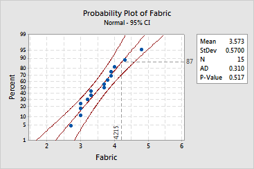
A normal distribution with a mean of 3.573 and a standard deviation of 0.57 appears to fit your sample data fairly well:
Because the distribution fits your data, you can use the fitted line to estimate percentiles for the population. The estimated 87th percentile for burn length is 4.215.
If you hover your mouse over the fitted line or confidence intervals, Minitab displays the fitted percentiles and associated confidence bounds for several points:
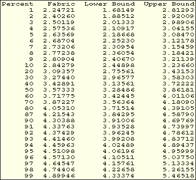
You can be 95% confident that the 87th percentile for the population is between 3.84295 and 4.58790.
|
Note |
Minitab calculates point-wise confidence intervals, thus the 95% confidence level applies only to individual intervals. If you use two or more intervals to estimate parameters, your actual confidence level for the group of estimates will be less than 95%. |