main topics interpreting results session commands see also
You are interested in the winning times for the men's 1500-meter run in the Olympics from 1900 to 2000. Because the Olympic Games were canceled in 1916 (WWI), and in 1940 and 1944 (WWII), you have irregularly-spaced time intervals. Thus, rather than use Graph > Time Series Plot, you should create a scatterplot with connect line to illustrate these data. Include custom titles, footnotes, and data labels to clarify what is being shown in the graph.
1 Open the worksheet TRACK1500.MTW.
2 Choose Graph > Scatterplot.
3 Choose With Connect Line, then click OK.
4 Under Y variables, enter Time. Under X variables, enter Year.
5 Click Labels.
6 In Title, type Olympic Games Track & Field.
7 In Subtitle 1, type Winning times men's 1500-meter run.
8 In Footnote 1, type 1900-2000.
9 In Footnote 2, type Not held in 1916, 1940, and 1944.
10 Click the Data Labels tab.
11 Choose Use labels from column and enter Year.
12 Click OK in each dialog box.
Graph window output
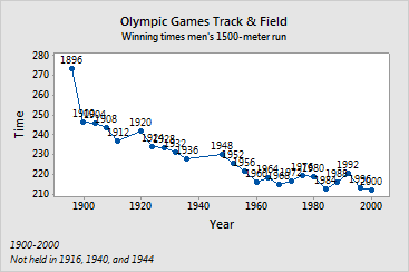
From 1900 to 1960, winning times generally decreased. The data labels help show that during this period there were only two games, 1920 and 1948, in which the winning time did not decrease from the previous games. After 1960, the winning times changed very little.
In the early half of the century, improvements such as training methods, nutrition, track composition, and track shoes removed many barriers to faster times. After 1960, the limitations of the athletes may have had a greater impact on the improvement in times.