main topics interpreting results session command see also
You are interested in how well a new formulation of your company's camera batteries is meeting customers' needs. Market research shows that customers become annoyed if they have to wait longer than 5.25 seconds between flashes.
You collect samples of batteries (both old and new formulations) that have been in use for varying amounts of time. You then measure the voltage remaining in each battery immediately after a flash (VoltsAfter), as well as the length of time required for the battery to be able to flash again (flash recovery time, FlashRecov). Create a scatterplot, grouped by formulation, to examine the results. Include regression lines for each group, as well as a reference line at the critical flash recovery time of 5.25 seconds.
1 Open the worksheet BATTERIES.MTW.
2 Choose Graph > Scatterplot.
3 Choose With Regression and Groups, then click OK.
4 Under Y variables, enter FlashRecov. Under X variables, enter VoltsAfter.
5 In Categorical variables for grouping (0-3), enter Formulation.
6 Click Scale, then click the Reference Lines tab.
7 In Show reference lines at Y values, type 5.25. Click OK in each dialog box.
Graph window output
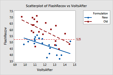
Minitab calculates a separate regression equation for each group and plots the regression lines on the graph. These regression lines suggest that recovery times for the old formulation are generally higher than those achieved with the new formulation across the range of voltages tested. For the old formulation, voltages below about 1.38 are associated with recovery times of greater than 5.25. In contrast, for the new formulation, voltages as low as about 1.03 are still associated with recovery times lower than 5.25.
|
Tip |
To see the regression equation, hover your cursor over the line. |