main topic interpreting results session commands see also
You own stocks in two companies (ABC and XYZ) and you want to compare their monthly performance for two years. Create an overlaid time series plot of share prices for ABC and XYZ.
1 Open the worksheet SHAREPRICE.MTW.
2 Choose Graph > Time Series Plot or Stat > Time Series > Time Series Plot.
3 Choose Multiple, then click OK.
4 In Series, enter ABC XYZ.
5 Click Time/Scale.
6 Under Time Scale, choose Calendar, then choose Month Year.
7 For start values, under Month, enter 1. Under Year, enter 2001.
8 Click OK in each dialog box.
Graph window output
|
Tip |
To see the y- and x-values for a symbol in a series, hover your cursor over the symbol. |
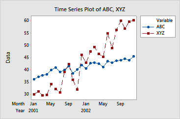
The solid line for ABC share price shows a slow increase over the two-year period. The dashed line for XYZ share price also shows an overall increase for the two years, but it fluctuates more than that of ABC. The XYZ share price starts lower than ABC (30 vs. 36.25 for ABC). By the end of 2002, the XYZ price surpasses the ABC price by 14.75 (44.50 to 60.25).