main topic interpreting results session command see also
Suppose you work for a company that manufactures tires. You are interested in finding out how many miles it takes for various proportions of the tires to "fail," or wear down to 2/32 of an inch of tread. You are especially interested in knowing how many of the tires last past 45,000 miles. You plan to get this information by using Parametric Distribution Analysis (Arbitrary Censoring), but first you want to have a quick look at your data from different perspectives.
You inspect each good tire at regular intervals (every 10,000 miles) to see if the tire has failed, then enter the data into the Minitab worksheet.
1 Open the worksheet TIREWEAR.MTW.
2 Choose Stat > Reliability/Survival > Distribution Analysis (Arbitrary Censoring) > Distribution Overview Plot.
3 In Start variables, enter Start. In End variables, enter End.
4 In Frequency columns, enter Freq.
5 In Distribution, choose Smallest extreme value. Click OK.
Session window output
Distribution Overview Plot: Start = Start and End = End
Using frequencies in Freq
Goodness-of-Fit
Anderson-Darling Distribution (adj) Smallest Extreme Value 2.426
Distribution Overview Plot for Start |
Graph window output
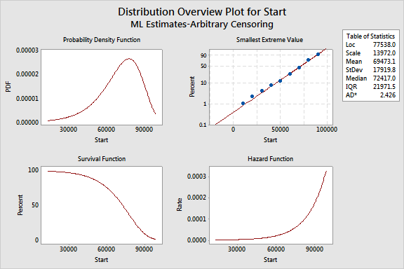
These four plots describe the failure rate for tires over time. With these plots, you can determine that approximately 90% of the tires last past 45,000 miles.