main topic interpreting results session command see also
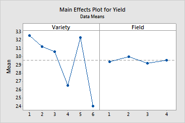
You grow six varieties of alfalfa on plots within four different fields and you weigh the yield of the cuttings. You are interested in comparing yields from the different varieties and consider the fields to be blocks. You want to preview the data and examine yield by variety and field using the main effects plot.
1 Open the worksheet ALFALFA.MTW.
2 Choose Stat > ANOVA > Main Effects Plot.
3 In Responses, enter Yield.
4 In Factors, enter Variety Field. Click OK.
Graph window output

The main effects plot displays the response means for each factor level in sorted order if the factors are numeric or date/time or in alphabetical order if text, unless value ordering has been assigned (see Ordering Text Categories). A horizontal line is drawn at the grand mean. The effects are the differences between the means and the reference line. In the example, the variety effects upon yield are large compared to the effects of field (the blocking variable).