main topic interpreting results session command see also
You record the following characteristics for 14 census tracts: total population (Pop), median years of schooling (School), total employment (Employ), employment in health services (Health), and median home value (Home). The data were obtained from [6], Table 8.2.
You perform principal components analysis to understand the underlying data structure. You use the correlation matrix to standardize the measurements because they are not measured with the same scale.
1 Open the worksheet EXH_MVAR.MTW.
2 Choose Stat > Multivariate > Principal Components.
3 In Variables, enter Pop-Home.
4 Under Type of Matrix, choose Correlation.
5 Click Graphs and check Scree plot and Outlier plot.
6 Click OK in each dialog box.
Session window output
Principal Component Analysis: Pop, School, Employ, Health, Home
Eigenanalysis of the Correlation Matrix
Eigenvalue 3.0289 1.2911 0.5725 0.0954 0.0121 Proportion 0.606 0.258 0.114 0.019 0.002 Cumulative 0.606 0.864 0.978 0.998 1.000
Variable PC1 PC2 PC3 PC4 PC5 Pop 0.558 0.131 -0.008 -0.551 0.606 School 0.313 0.629 0.549 0.453 -0.007 Employ 0.568 0.004 -0.117 -0.268 -0.769 Health 0.487 -0.310 -0.455 0.648 0.201 Home -0.174 0.701 -0.691 -0.015 -0.014 |
Graph window output


The first principal component has variance (eigenvalue) 3.0289 and accounts for 60.6% of the total variance. The coefficients listed under PC1 show how to calculate the principal component scores:
PC1 = 0.558 Pop + 0.313 School + 0.568 Employ + 0.487 Health - 0.174 Home
It should be noted that the interpretation of the principal components is subjective, however, obvious patterns emerge quite often. For instance, one could think of the first principal component as representing an overall population size, level of schooling, employment level, and employment in health services effect, because the coefficients of these terms have the same sign and are not close to zero.
The second principal component has variance 1.2911 and accounts for 25.8% of the data variability. It is calculated from the original data using the coefficients listed under PC2. This component could be thought of as contrasting level of schooling and home value with health employment to some extent.
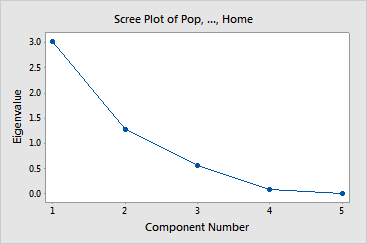
Together, the first two and the first three principal components represent 86.4% and 97.8%, respectively, of the total variability. Thus, most of the data structure can be captured in two or three underlying dimensions. The remaining principal components account for a very small proportion of the variability and are probably unimportant. The Scree plot provides this information visually.
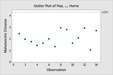
It is important to check for outliers because they can significantly influence your results. The outlier plot displays Mahalanobis distances for each observation in your worksheet. Points that fall above the y-axis reference line are outliers. There do not appear to be any outliers in the census data.