main topic interpreting results session command see also
One product that a company makes are molded resin parts. The company knows that contamination in pipes and abrasions during transfer through hoses can lead to discolored streaks in the final product. A larger screw passes the pellets through the hoses faster. With a new type of resin pellet, the company decides to collect data on these discoloration defects to learn about the best way to transfer pellets.
1 Open the worksheet ResinDefects.MTW.
2 Choose Stat > Regression > Poisson Regression > Fit Poisson Model.
3 In Response, enter 'Discoloration Defects'.
4 In Continuous predictors, enter 'Hours Since Cleanse' and Temperature.
5 In Categorical predictors, enter 'Size of Screw'.
6 Click Model.
7 In Predictors, select Temperature and 'Size of Screw'.
8 For Interactions through order, choose 2.
9 Next to Interactions through order, click Add.
10 Click OK in both dialog boxes.
11 To recall the last dialog box, press [Ctrl]+[E].
12 In Response, enter 'Clump Defects'.
13 Click OK.
14 Choose Stat > Regression > Poisson Regression > Overlaid Contour Plot.
15 Click ![]() to select both available
responses.
to select both available
responses.
16 Under Variables, in X Axis, choose 'Hours Since Cleanse'.
17 Under Variables, in Y Axis, choose Temperature.
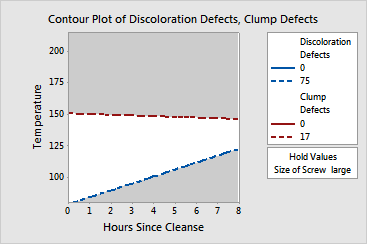
18 Click Contours. Complete the Low and High columns of the table as shown below, then click OK.
|
Response |
Low |
High |
|
Discoloration Defects |
0 |
75 |
|
Clump Defects |
0 |
17 |
19 Click OK in each dialog box.
Graph Window Output

The white area in the plot displays the combination of values for Temperature and Hours Since Cleanse that yield satisfactory fitted values for both response variables. You can change the holding value to see the range change. To understand the feasible region formed by the three factors, you should repeat the process to obtain plots for the different levels of the hold variable.
You can use the plots in combination with the optimization plot to find the best operating conditions for the focal points.
This plot uses model equations. Ensure that your models are adequate before you interpret the plot.