main topic interpreting results session command see also
One product that a company makes are molded resin parts. The company knows that contamination in pipes and abrasions during transfer through hoses can lead to discolored streaks in the final product. A larger screw passes the pellets through the hoses faster. With a new type of resin pellet, the company decides to collect data on these discoloration defects to learn about the best way to transfer pellets.
1 Open the worksheet ResinDefects.MTW.
2 Choose Stat > Regression > Poisson Regression > Fit Poisson Model.
3 In Response, enter 'Discoloration Defects'.
4 In Continuous predictors, enter 'Hours Since Cleanse' and Temperature.
5 In Categorical predictors, enter 'Size of Screw'.
6 Click Model.
7 In Predictors, select 'Temperature' and 'Size of Screw'.
8 For Interactions through order, choose 2.
9 Next to Interactions through order, click Add.
10 Click OK in both dialog boxes.
11 Choose Stat > Regression > Poisson Regression > Surface Plot.
12 In Variables select Generate plots for all pairs of continuous variables.
13 In Generate plots for all pairs of continuous variables select On separate graphs.
14 Press Settings.
15 In Hold categorical variables at choose small.
16 Click OK in both dialog boxes.
Graph window output

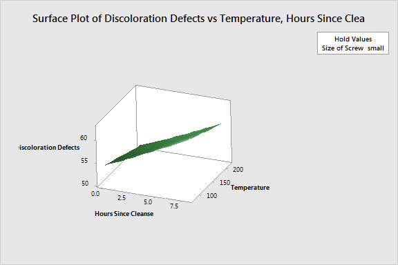
You can see that the highest number of defects occur when the Temperature is low and the Hours Since Clense is high. The surface is relatively flat across temperatures, which shows that the temperature effect is small compared to the time effect for the small screw.
This plot uses a model equation. Ensure that your model is adequate before you interpret the plot.