
G Chart
Graphs - G Chart
![]()
![]()
![]()
|
|
G ChartGraphs - G Chart |
|
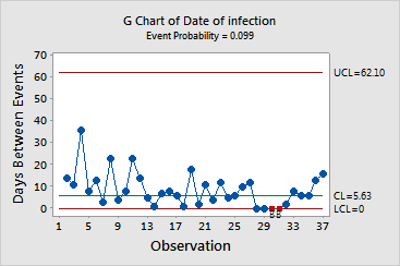
G charts monitor the number of opportunities or, in many cases, days between rare events. The G chart consists of the following elements:
For G charts, Minitab conducts up to five tests for special causes, each of which detects a specific pattern in the data. When a data point fails a test, Minitab marks it on the G chart with a red symbol and with the number or letter of the test that failed. A failed point indicates that there is a nonrandom pattern in the data which may be the result of special cause variation. These points should be investigated.
|
Tip |
Minitab recommends using both Tests 1 and 2 when creating a G chart because the G chart may be slow to detect small to moderate decreases in the average time between events. |
Example Output |
|
Interpretation |
|
The G chart for the infection data can be summarized as follows:
Next, you should try to identify and correct the factors that contribute to this special cause variation. Until these causes are eliminated, the process cannot achieve a state of statistical control.