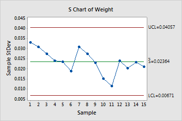
S charts assess whether the process variation
is in control.
An S chart consists of the following:
· Plotted
points, which represent subgroup standard deviations,
and provide an indication of the variation
present within the subgroup.
· Center line
(green), which is the estimate of the process standard deviation (average
of all the subgroup standard deviations).
· Control limits
(red), which are located above and below the center line, and provide
a visual means for assessing when the process is out of control. The control limits, which represent the amount of variation
expected for the subgroup standard deviations, are calculated using the
variation within subgroups.
Minitab conducts up to four tests for special causes
for the S chart, which detect points beyond the control limits and specific
patterns in the data. Points that fail are marked with a red symbol and
the number of the failed test. Complete results are available in the Session
window. A failed point indicates that there is a non-random
pattern in the data that may be the result of special-cause
variation.
These points should be investigated.
Example Output |

|

Interpretation |

|
The S chart for the canning data can be summarized as follows:
· The
lower and upper control limits are 0.00671
and 0.04057, respectively. Therefore, the
subgroup ranges are expected to fall between 0.00671
and 0.04057. The center line (estimate of
process standard deviation)
is 0.02364.
· None
of the canning data subgroups fall outside the control limits. Furthermore,
the points inside the limits display a random pattern. This S chart does
not provide any evidence for lack of control. Thus, the process variation
is in control.
