|
|
Display Descriptive StatisticsGraphs - Histogram of Data |
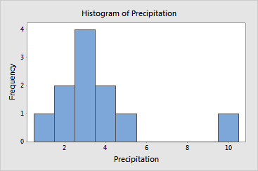
A histogram displays data that have been summarized into intervals. It can be used to assess the symmetry or skewness of the data. To construct a histogram, the horizontal axis is divided into equal intervals, and a vertical bar is drawn at each interval to represent its frequency (the number of values that fall within the interval).
Example Output |

Interpretation |
In the histogram of the precipitation data, notice the single extreme value in the interval from 9.5 to 10.5. If not for this outlier, the distribution would be perfectly symmetric and fairly normal.