|
|
Factorial Plots
|
Use interaction plots to assess two-way interactions. Evaluate the lines to understand how interactions affect the response.
As always, plots indicate patterns. To determine if a pattern is statistically significant, check the p-value of the interaction term in the analysis of variance table.
|
Note |
An interactions plot for two variables can be displayed in two ways (variable 1 by variable 2 or variable 2 by variable 1). How you plot your data can make some patterns easier to see. However, if the two variables interact, you can see this in both plots. |
If you have three or more variables, Minitab displays a matrix plot. The default plot has one panel for each pair of variables in your data set. Or, you can display two panels for each pair of variables, one for each order of the variables (as shown here). You can use either or both plots to assess how the variables interact. Although an interaction should show up in both panels, it may be easier to see the interaction in one panel than the other panel.
Factorial plots do not use the data in the worksheet for the fitted means. Instead, Minitab estimates the fitted means based on a stored model. You must fit a model before you can generate a factorial plot. To produce an interaction plot, you must include two or more variables in the plots. Factorial plots are accurate only if the model represents the true relationships.
Example Output |

Interpretation |
|
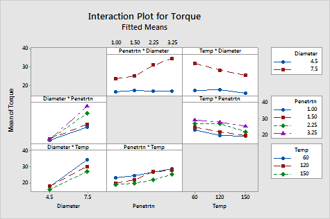
The plywood data set has three variables: diameter, temperature, and penetration. The graph displays a full interactions plot matrix. Each pair of variables provides two panels as summarized below. To determine if a pattern is statistically significant, check the p-value of the interaction term in the analysis of variance table.
- Row 1 panel: Diameter = 7.5 increases as Penetration increases. Diameter = 4.5 stays about the same as Penetration increases.
- Row 2 panel: The lines for the four levels of Penetration fan out - as Diameter increases all lines increase but at different rates.
- Row 1 panel: The red line decreases as temperature increases, whereas the blue line stays about the same as Penetration increases.
- Row 3 panel: The green and red lines (Temperature = 150 and 120 respectively) are parallel, with the blue line (Temperature = 60) increasing slightly faster than the other two.
The interaction here does not seem as strong as the interaction for Diameter and Penetration.
- Row 2 panel: All four lines are approximately parallel, with the possible exception of the green line (Penetration = 2.25).
- Row 3 panel: All three lines are approximately parallel, with the possible exception of the red line (Temperature = 120).