main topic interpreting results session command see also
The records management staff at a small hospital improved the accuracy and completeness of patient records. To sustain these improvements, the staff tracks the number of incomplete and inaccurate records that are filed each day.
The average subgroup size is more than 2500. Because of the large number of records, the staff wants to determine whether to use a Laney P' chart.
1 Open the worksheet DEFECTIVERECORDS.MTW.
2 Choose Stat > Control Charts >Attributes Charts > P Chart Diagnostic.
3 In Variables, enter Defectives.
4 In Subgroup sizes, enter 'Total Records'. Click OK.
Graph window output
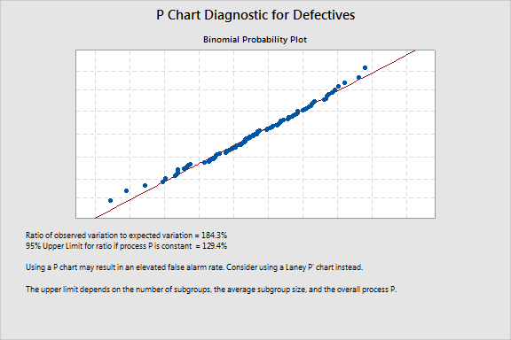
The high ratio of observed variation to expected variation, 184.3%, suggests overdispersion. Overdispersion can cause points on a traditional P chart to appear to be out of control when they are not. To correct for overdispersion, use a Laney P' chart.
To see the same data plotted on both a traditional P chart and a Laney P' chart, see Comparing traditional P charts and Laney P' charts.