main topic interpreting results session command see also
Suppose you work for a company that manufactures motorcycles. You hope to reduce quality costs arising from defective speedometers. During inspection, a certain number of speedometers are rejected, and the types of defects recorded. You enter the name of each defect into a worksheet column called Defects, and the corresponding counts into a column called Counts. You know that you can save the most money by focusing on the defects responsible for most of the rejections. A Pareto chart will help you identify which defects are causing most of your problems.
1 Open the worksheet EXH_QC.MTW.
2 Choose Stat > Quality Tools > Pareto Chart.
3 In Defects or attribute data in, enter Defects. In Frequencies in, enter Counts.
4 Click OK.
Graph window output
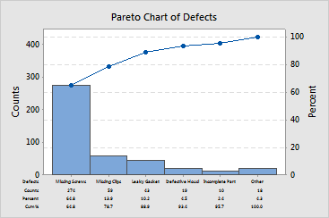
Focus on improving the number of missing screws because over half of your speedometers are rejected due to this defect.