main topic interpreting results session command see also
The company you work for manufactures metal bookcases. During final inspection, a certain number of bookcases are rejected due to scratches, chips, bends, or dents. You want to make a Pareto chart to see which defect is causing most of your problems. You enter the name of the defect each time it occurs in a single worksheet column called Damage.
1 Open the worksheet EXH_QC.MTW.
2 Choose Stat > Quality Tools > Pareto Chart.
3 In Defects or attribute data in, enter Damage.
4 Click OK.
Graph window output
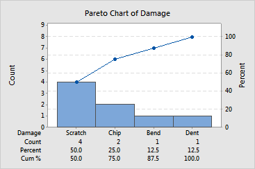
Focus on improvements to scratches and chips because 75% of the damage is due to these defects.