main topic
When the data follow a symmetric distribution, the data will fall along the line Y=X in a symmetry plot. Minitab draws a reference line on the plot that represents a perfectly symmetric sample. Compare the data points to the line to assess the degree of symmetry present in your data. The more symmetric the data, the closer the points will be to the line. Even with normally distributed data, you can expect to see runs of points above or below the line. The important thing to look for is whether the points remain close to or parallel to the line, versus the points diverging from the line. You can detect the following asymmetric conditions:
|
|
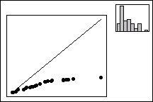
Skewness to the right |
|
|
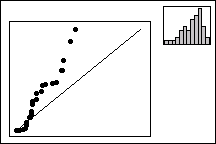
Skewness to the left |
|
Lower Distance to Median |
Upper distance to Median |
|
Lower Distance to Median |
Upper distance to Median |
|
|
The points diverge below the line, indicating skewness to the right. The distribution stretches out further to the right than the left. This pattern is common when you have non-negative data (counts, measurements). |
|
|
The plot points diverge above the line, indicating skewness to the left. The distribution stretches out further to the left than the right. |
|
Caution |
As rule of thumb, you should have at least 25 to 30 data points. Interpreting a plot with too few data points may lead to incorrect conclusions. |