main topic interpreting results session command see also
Needlestick injuries can occur when medical professionals draw blood, administer medications, or dispose of used needles. Because these injuries can transmit blood-borne diseases, a metropolitan hospital has implemented rigorous protocols to reduce the number of needlesticks. To monitor the effectiveness of these protocols, hospital staff record the date and time of each needlestick. Because this data is rare event data, the staff use a T chart.
1 Open the worksheet NEEDLESTICKS.MTW.
2 Choose Stat > Control Charts > Rare Event Charts > T.
3 From Form of data, choose Dates/Times of events or Time between events.
4 In Variables, enter 'Date and time of needlestick'.
5 Click OK.
Session window output
T Chart of Date and time of needlestick
Test Results for T Chart of Date and time of needlestick
TEST 2. 9 points in a row on same side of center line. Test Failed at points: 39
* WARNING * If graph is updated with new data, the results above may no * longer be correct. |
Graph window output
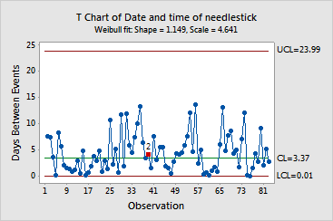
The time between needlesticks are within the control limits. However, point 39 failed test 2 (9 points in a row on same side of center line). Points 31 through 39 are above the center line. The rate of needle sticks was lower than expected during this time. The lower rate indicates a possible improvement.