main topic interpreting results session command see also
As the distribution manager at a limestone quarry, you want to monitor the weight (in pounds) in 45 batches of limestone that are shipped weekly to an important client. Each batch should weight approximately 930 pounds. You previously created an I-MR chart. Now you want to examine the same data using a moving average chart.
1 Open the worksheet EXH_QC.MTW.
2 Choose Stat > Control Charts > Time-weighted charts > Moving Average.
3 Choose All observations for a chart are in one column, then enter Weight.
4 In Subgroup sizes, enter 1. Click OK.
Session window output
Moving Average Chart of Weight
Test Results for Moving Average Chart of Weight
TEST 1. One point more than 3.00 standard deviations from center line. Test Failed at points: 5, 7, 24, 30, 31, 32, 33, 44, 45
* WARNING * If graph is updated with new data, the results above may no * longer be correct. |
Graph window output
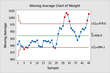
The moving average chart shows nine points that are more than 3 standard deviations away from the center line. You should closely examine the quarry's processes to improve control over the weight of the limestone shipments.