main topic interpreting results session command see also
You work at an automobile engine assembly plant. One of the parts, a camshaft, must be 600 mm +2 mm long to meet engineering specifications. A chronic problem exists with camshaft length being out of specification, which causes poor-fitting assemblies, resulting in high scrap and rework rates. You collect a total of 100 observations (20 samples of 5 camshafts each) from each of your suppliers. You have already made an X and R chart for supplier 1. Your supervisor would also like you to create moving range charts for each supplier to track process variation. You want to make the y-scales of the charts the same so that the charts are easier to compare.
1 Open the worksheet CAMSHAFT.MTW.
2 Choose Stat > Control Charts > Variables Charts for Individuals > Moving Range.
3 In Variables, enter Supp1 Supp2.
4 Click Multiple Graphs. Under Scales for Different Variables, check Same Y.
5 Click OK.
Session window output
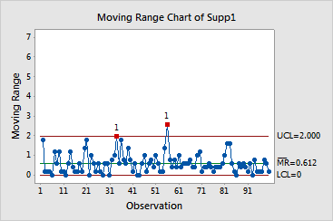
Moving Range Chart of Supp1
Test Results for MR Chart of Supp1
TEST 1. One point more than 3.00 standard deviations from center line. Test Failed at points: 34, 56
* WARNING * If graph is updated with new data, the results above may no * longer be correct. |
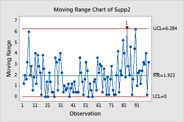
Moving Range Chart of Supp2
Test Results for MR Chart of Supp2
TEST 1. One point more than 3.00 standard deviations from center line. Test Failed at points: 83
* WARNING * If graph is updated with new data, the results above may no * longer be correct. |
Graph window output


The moving range chart for supplier 1 shows two points outside the control limits, while the moving range chart for Supplier 2 shows one point outside the control limits. For the most part, the process variation for both suppliers is within the control limits.