main topic interpreting results session command see also
Suppose you want to display an S chart to monitor the variability of faults during three shifts over the course of a week. The subgroup sizes in your data are unequal because the number of measures taken during the shifts varies.
1 Open the file EXH_QC.MTW.
2 Choose Stat > Control Charts > Variables Charts for Subgroups > S.
3 Choose All observations for a chart are in one column, then enter Faults.
4 In Subgroup sizes, enter Shift.
5 Click OK.
Graph window output
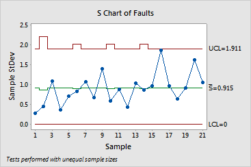
The sample standard deviations fall randomly within the control chart limits. You can conclude that the variability of faults among shifts is due to common causes.