main topic interpreting results session command see also
Suppose that you work at a car assembly plant in a department that assembles engines. In an operating engine, parts of the crankshaft move up and down a certain distance from an ideal baseline position. AtoBDist is the distance (in mm) from the actual (A) position of a point on the crankshaft to the baseline (B) position.
To monitor the process, you collect a subgroup of 5 parts each afternoon and measure the AtoBDist for the parts. After 13 days, you decide that it would be useful to sample the process during the morning shift as well. You decide to collect two subgroups of parts each day, one during the morning shift and one during the afternoon shift.
You want to draw an X chart to track the process level and to test for the presence of special causes.
1 Open the worksheet CRANKSH.MTW.
2 Choose Stat > Control Charts > Variables Charts for Subgroups > Xbar.
3 Choose All observations for a chart are in one column, then enter AtoBDist.
4 In Subgroup sizes, enter 5.
5 Click Xbar Options, then click the Tests tab.
6 Choose Perform all tests for special causes.
7 Click the Limits tab.
8 Under Display additional sigma limits at, enter 1 2 in These multiples of the standard deviation.
9 Click OK in each dialog box.
Session window output
Xbar Chart of AtoBDist
Test Results for Xbar Chart of AtoBDist
TEST 6. 4 out of 5 points more than 1 standard deviation from center line (on one side of CL). Test Failed at points: 5
* WARNING * If graph is updated with new data, the results above may no * longer be correct. |
Graph window output
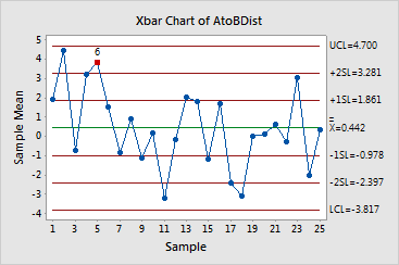
Subgroup 5 failed Test 6, meaning four of five points are more than one standard deviation from one side of the center line. This suggests the presence of special causes.