R chart
Plots the process range over time for variables data in subgroups. This
control chart is widely used to examine the stability of processes in
many industries. For example, you can use R charts to examine process
variation for subgroups of part lengths, call times, or hospital patients'
blood pressure over time.
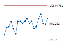
Consider the R chart below. A plastic manufacturer wants to assess if
its production process is in control for one of its new products. They
sample 5 products every hour for 20 hours and assess the strength of the
plastic.
|
|
The points vary randomly around the center line and are within the control
limits. No trends or patterns are shown. The variability in the strength
of the plastic product is stable across the 20 subgroups.
The center line is the average range of all subgroups (Rbar). |
Examine the process variation using a R chart before interpreting the
process average with an Xbar chart. The process variation must be in control
to correctly interpret the Xbar chart because the control limits of the
Xbar chart are calculated considering both process spread and center.
If the R chart
is out of control, then the control limits on the Xbar chart may be inaccurate
and may falsely indicate an out-of-control condition.
Use the R chart when your subgroup size is eight or less. Use the S
chart when your subgroup size is nine or more.