Bar

In Minitab, the height of each bar on a graph represents a statistic for a category (categorical data) or interval (continuous data).

 Minitab displays bars by default for histograms, bar charts, and Pareto charts:


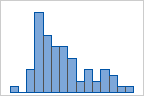
Histogram: By default, bars represent the number (frequency) of observations falling within each interval (bin) for a continuous variable.


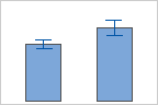
Bar chart: Bars represent category tallies, different statistics of categories (e.g., mean, sum), or summary values of categories.


Pareto chart: Bars represent counts for types of defects.

You can display bars in marginal plots, interval plots, and individual value plots. For example:


Marginal plot: Histograms in the margins represent the frequency of x and y values, allowing you to visualize the distributions of x and y, as well as their relationship.


Interval plot: Bars represent the means of the categories, so that you to compare the means of categories as you examine their confidence intervals.