Sample Value
Upper Control Limit
Center Line
Lower Control Limit
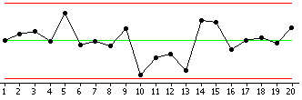
Plots your process data in time-ordered sequence to help identify common cause and special cause variation. By identifying the different causes of variation, you can take action on your process without over-controlling it. For example, your call center has variability in the average wait time. Some of this variability is expected and is characteristic of the process (common cause). Other times, the variability is different than what is expected due to some influence that is not part of the normal process (special cause).
While there are several different control charts that you can choose depending on your data, all control charts share the same basic components:
|
Sample Value |
|
Upper Control Limit |
|
Center Line | ||
|
Lower Control Limit |
To choose the appropriate control chart, first determine whether your data are variables (continuous) or attribute (discrete). If your data are variables, do you have subgroups or individual observations? If your data are attribute, do you have proportions or counts? Do you have constant sample sizes?
|
Variables Data |
Attribute Data |
||
|
Subgroup |
Individuals |
Proportions |
Counts |
|
Xbar |
Individuals |
P |
U |
|
R |
Moving Range |
Laney P' |
Laney U' |
|
Xbar-R |
I-MR |
NP |
C |
|
I-MR-R/S |
Z-MR |
|
|
|
Zone |
|
|
|
Minitab also offers time-weighted control charts, multivariate control charts, and rare event charts.