Poisson capability plots
These plots appear in the output of Poisson capability analysis to help
verify whether your data follow a Poisson distribution. If they do not,
Poisson capability analysis is not appropriate for your data. Minitab
generates a Defect rate plot when subgroup sizes vary, and a Poisson plot
when subgroup sizes are constant.
Defect rate plot
This chart helps you verify whether a Poisson distribution fits your
data by checking the assumption that the DPU (defects per unit) is constant.
If your data violate this assumption, your capability analysis may be
invalid.
This chart plots the DPU (defects per unit) in each subgroup against
the subgroup's sample size. The center line equals the mean DPU; the confidence
bounds for the mean lie above and below the center line.
If your data fall randomly about the center line, you conclude the Poisson
distribution is a good fit for your data, and proceed with your analysis.
If the points fall in a nonrandom pattern, the Poisson distribution may
not be appropriate for your data, and your capability analysis may be
invalid.
|
|
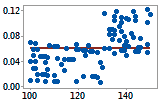
Defect rate plot |
|
|
DPU |
|
DPU is affected by sample size. The data may not follow
a Poisson distribution. |
|
|
Sample size |
|
|
|
|
|
|
|
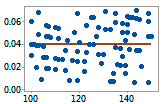
Defect Rate plot |
|
|
DPU |
|
The data fall randomly around the center line. It is
reasonable to assume the data come from a Poisson distribution. |
|
|
Sample size |
|
Poisson plot
This chart helps verify whether a Poisson distribution fits your data
by plotting the expected number of defects against the observed number.
The diagonal line shows where the data would fall if they perfectly follow
a Poisson distribution. If the data stray significantly from this line,
Poisson capability analysis may not be valid.
|
|
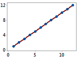
Poisson plot |
|
|
Expected Defects |
|
The data points fall closely along the line. It is reasonable
to assume the data follows a Poisson distribution. |
|
|
Observed Defects |
|